If a picture is worth a thousand words, imagine how much a photo series can say! The combination of three or more photos, I believe, composes a series. It can be an accumulation of photos over a long period of time with a similarity such as a common theme/meaning, a photo-journal of a certain time period, such as a vacation, with common visual aspects (like composition or colour), a collection of prints of the same subject from different perspectives, and much more- basically, the possible themes/ideas dictating a photo series are limitless.
If the unlimited world of possibilities doesn't compel you to begin a photo series of your own, the fact that minimal effort can be required to do so should certainly be a motivator. When you are out and about, it's just not convenient to bring your camera everywhere or take photos
all the time. Taking
one or two photos per day during your travels, dates, or social outings can be a lot easier than trying to catch every potentially great shot: that's why you may want to keep a certain idea or theme in mind wherever you go. Keeping in line with a theme can generate a great series of photos, portraying change, adventure, growth and/or the passage of time. Plus, they're totally fun to look through later, once you've put them together.
You can arrange your work in consecutive order of time, by place or depending on the mood the photos portray; play around and see what works best for a particular series/journal, keeping in mind, again, that there really are no limits or rules. Enjoy yourself!
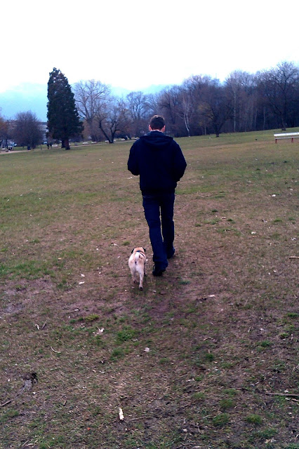
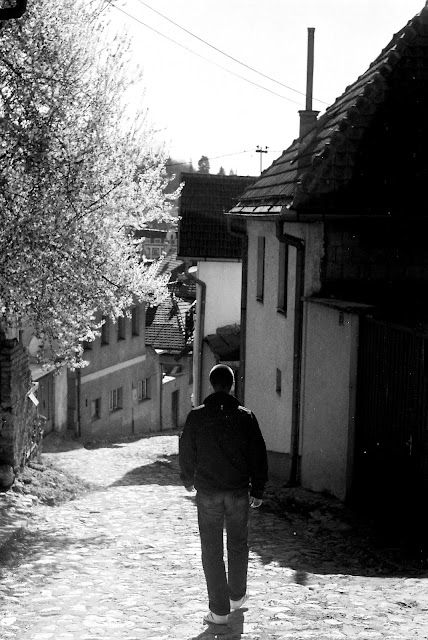
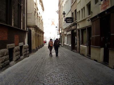
Here is a series of photos I've put together of my boyfriend, Ado, during our outings and travels over the past few years. Pardon the varying quality of photos, since they weren't all taken with the same camera (I used whatever I had at hand). Nonetheless, I hope people are able to appreciate the idea and cohesion behind the series.
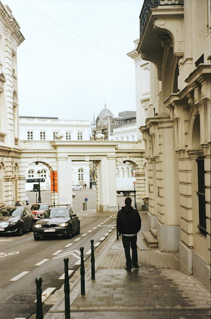 |
| Brussels, Belgium |
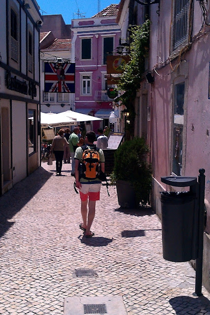 |
| Cascais, Portugal |
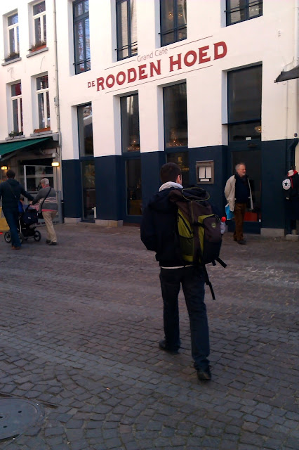 |
| Antwerp, Belgium |
 |
| Sofia, Bulgaria |
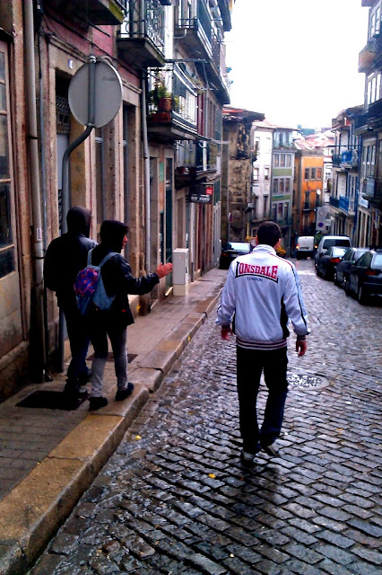 |
| Porto, Portugal |
 |
| Sarajevo, Bosnia and Herzegovina |
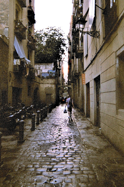 |
| Barcelona, Spain |
 |
| ... And here's one of us together in Brussels because DAMN IT I WAS THERE TOO |


